
7 useful Agile Metrics to optimise your learning
In this article we share our experiences of how these 7 Agile metrics can help you to understand how your system of work is performing.
Agile metrics are a common topic for our clients and often surrounded by confusion or fear. You can use Agile metrics to shine a light onto problems in your ways of working. There are times when you don’t realise you have a problem until you look at your ways of working through a particular lens.
I took my car in for its annual service. I wasn’t aware of any problems, had no warning indicators on the dashboard and the car operated well. The technician plugged my car into a laptop and found a number of issues in the logs that were affecting the cars performance and fuel efficiency.
At Solutioneers, when we work with a team we spend a large proportion of our time getting the team setup to run their own, continuous, diagnostic to gain insight and set them up for long term learning. The metrics we analyse are useful as a diagnostic tool to give you insight into problems you didn’t realise you had.
In this article we share our experiences of how these metrics can help you to understand how your system of work is performing, which may lead you to adapt your ways of working.
This article is underpinned by the following 5 important principles:
- Metrics are a diagnostic tool for learning, not a measurement of performance.
- NEVER measure people, always measure work.
- Never compare teams.
- Always understand why you’re measuring something but focus on learning
- “When a measure becomes a target, it ceases to be a good measure”, Marilyn Strathern
Health Warning
If you attempt to roll out all of the metrics in this article for no apparent reason, then you will certainly fail. This article does not attempt to prescribe any or all of the metrics presented but rather seeks to provoke thought through presenting some metrics we have found useful when working with teams. Some of the metrics are pretty common in the industry already. For the rest feel free experiment with them to learn more about how your work works.
Here we pickout 7 useful metrics to help you to learn more about your ways of working:
Agile Metrics #1 - Cycle Time
The cycle time metric provides an opportunity for an enormous amount of learning. There are many ways to learn from your cycle time data to seek out improvements. In this section we take you through some of the more common concepts of measuring, visualising and affecting cycle time.
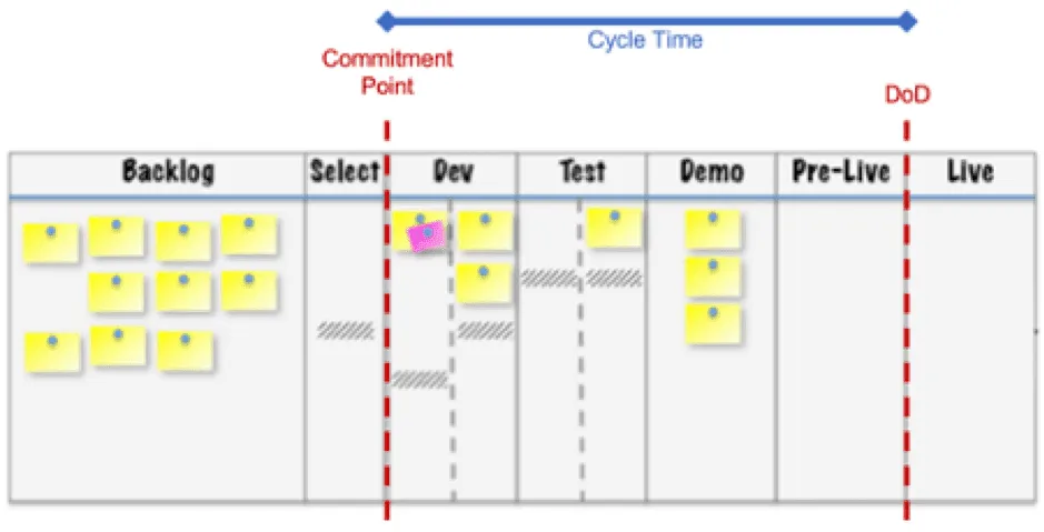
Cycle Time is the measure of how long it takes for each work item to get from the left side of the workflow to the right. Or more accurately, the clock starts ticking when work actually starts on a work item, e.g. it passes the commitment point, to when work is complete and meets the Definition of Done.
Only two data points are required to calculate cycle time for each work item. These are Start Date and Finish Date.
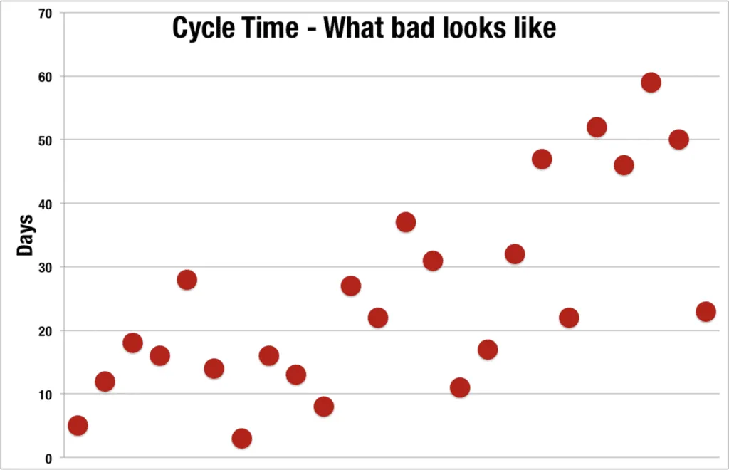
Pretty much every work item flowing through the workflow will have a different cycle time – we like to call this variation. Cycle time is commonly visualised in two ways, scatter plot and as a histogram representing the distribution and is a great way to understand how much variation you have in your flow.
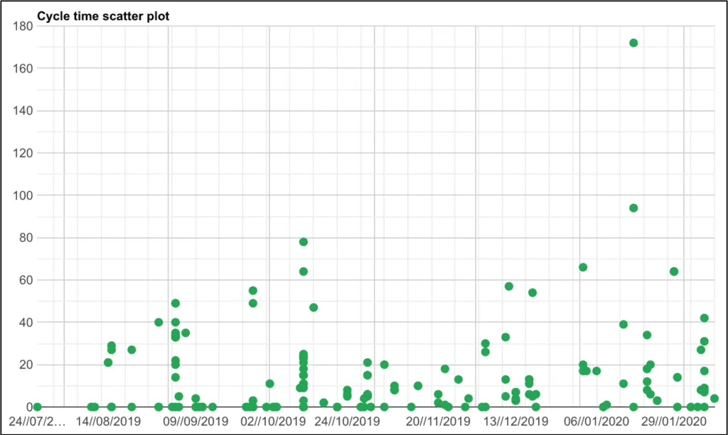
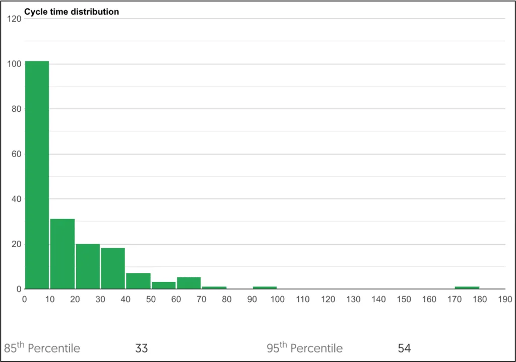
This is possibly the most powerful diagnostic metric for the team. The scatter plot shows how much variation in cycle time you have over time and the histogram shows the distribution of cycle time in order to use percentile confidence levels to manage stakeholder expectations.
Never present the cycle time of a team as a single figure or as an average. Instead present cycle time numbers as a distribution and level of confidence using percentiles.
Primary learning objective: to learn how we can reduce variation in cycle time. Predictability.
Secondary learning objective: learn how to reduce cycle time. Responsiveness.
To service these two learning objectives, we need to look at what is causing variation in our cycle time.
Here’s a list of common sources of variation experienced by software development and service management teams:
- Poor Technical Environments
- Poor configuration management
- Multi-tasking and context switching
- Scope Creep
- Everything is a priority / too many conflicting priorities
- Waiting Time
- Dependencies
- Technical Debt
- Too many Meetings and distractions
- Unfamiliar Tools
- Misinterpreted requirements
- Rework
- Little or no feedback
- Too much work in progress
- Hidden Complexity
- Pressure to hit deadlines
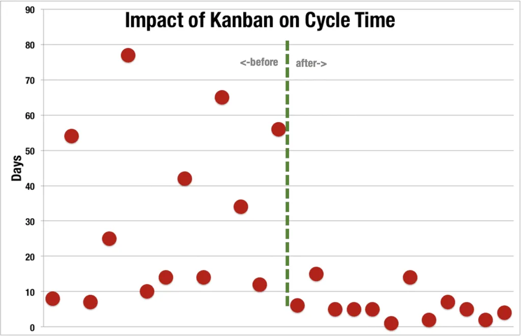
Here’s an example of how applying practices that limit WIP, focus on aging WIP, visualise and tackle blockers and reducing batch-size have a direct, measurable impact on cycle time:
The following scatter plot represents a team who are not managing their sources of cycle time variation and are becoming less predictable over time.
Aging WIP
Aging WIP is the measure of how long a work item has been in progress or stationary in a particular column or state. Work items will often sit in a queue ready to be pulled into the next step of the workflow.
Work items can also sit in an ‘in progress’ column with other work items passing them by. Therefore, it’s really important to pay particular attention to how long work items are sat in each step of the workflow.
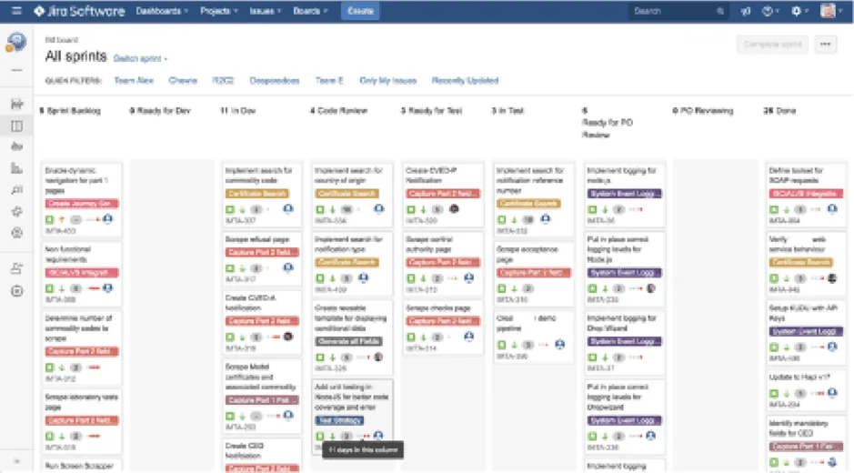
In the example board above, it’s not always obvious where work is dwelling / idling. Jira makes an attempt at showing where aging WIP is by showing dots on each work item towards the bottom of the card. Hovering your mouse over these dots reveals how long the work item has been sat in the current column. This is a feature you need to switch on in Jira – it’s turned off by default.
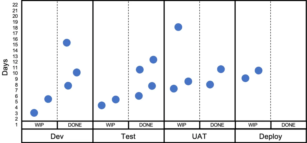
Flow Efficiency
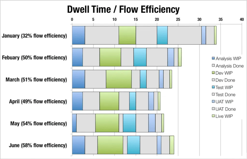
The diagram above shows one way to visualise Flow efficiency. It is calculated by taking the average of all work items wait time (queues) and work time (wip columns).
Blocked Time
Tracking how long work items are blocked for is useful during blocker clustering, particularly when clustering your blockers by time blocked.

Mileage
Dave Semmens at Sky Betting & Gaming in Leeds uses an interesting metric to learn about the journey of work items across the workflow. Every time a work item moves from one step of the workflow to another it clocks up one mile. Therefore, if a work item moves across the workflow and is then moved backwards for some reason it is highly likely to have a much higher mileage than other work items. This data is used retrospectively to learn about why items are moving backwards and what can be done to avoid this in the future.
Agile Metrics #2 - Lead Time
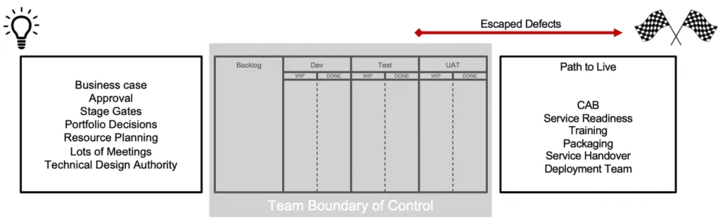
Cycle time covers the workflow steps that are within the control of the team, and you would hope cycle time includes all workflow stages to live. Lead Time expands upon this extending upstream and downstream (if necessary) to understand overall idea to value time. Cycle time could be classed as a measure of team maturity and Lead Time as organisational maturity.
Unfortunately, not all teams have the remit or sphere of control to deliver software from initial idea through to live as is depicted in the following diagram.
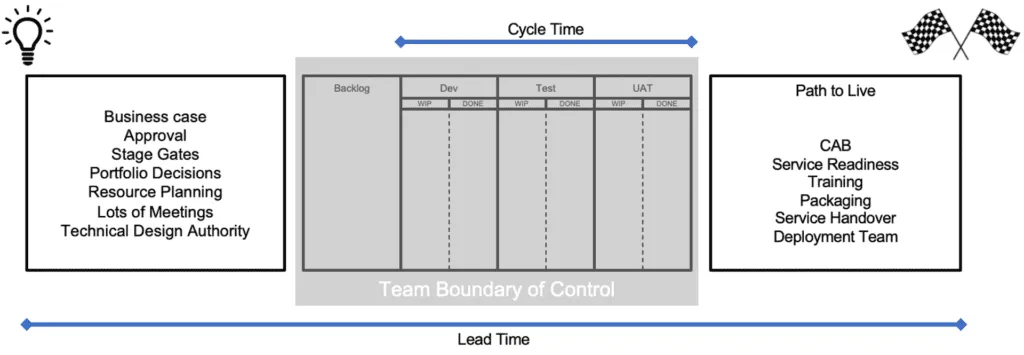
Lead Time is normally measured from upstream of the team in the often-fuzzy front end of requirements and business decisions. It is measured all the way downstream to the point where value is delivered to the customer.
Q) How can you influence upstream & downstream activities and stakeholders that are beyond your remit? A) Collect data.
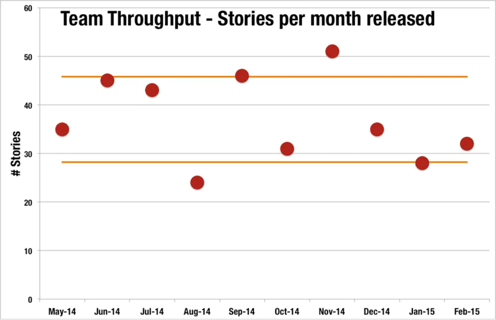
Agile Metrics #3 - Team Throughput
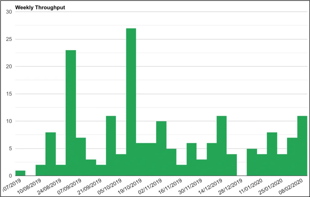
Measures the number of work items delivered over a set period of time. You can represent it as a simple graph as above or plot your data points on a control chart as in the chart below.
So, what can we learn from this in order to improve our ways of working? Use standard deviation to understand the expected predictable boundaries of the dataset, i.e. upper and lower control levels of predictable throughput.
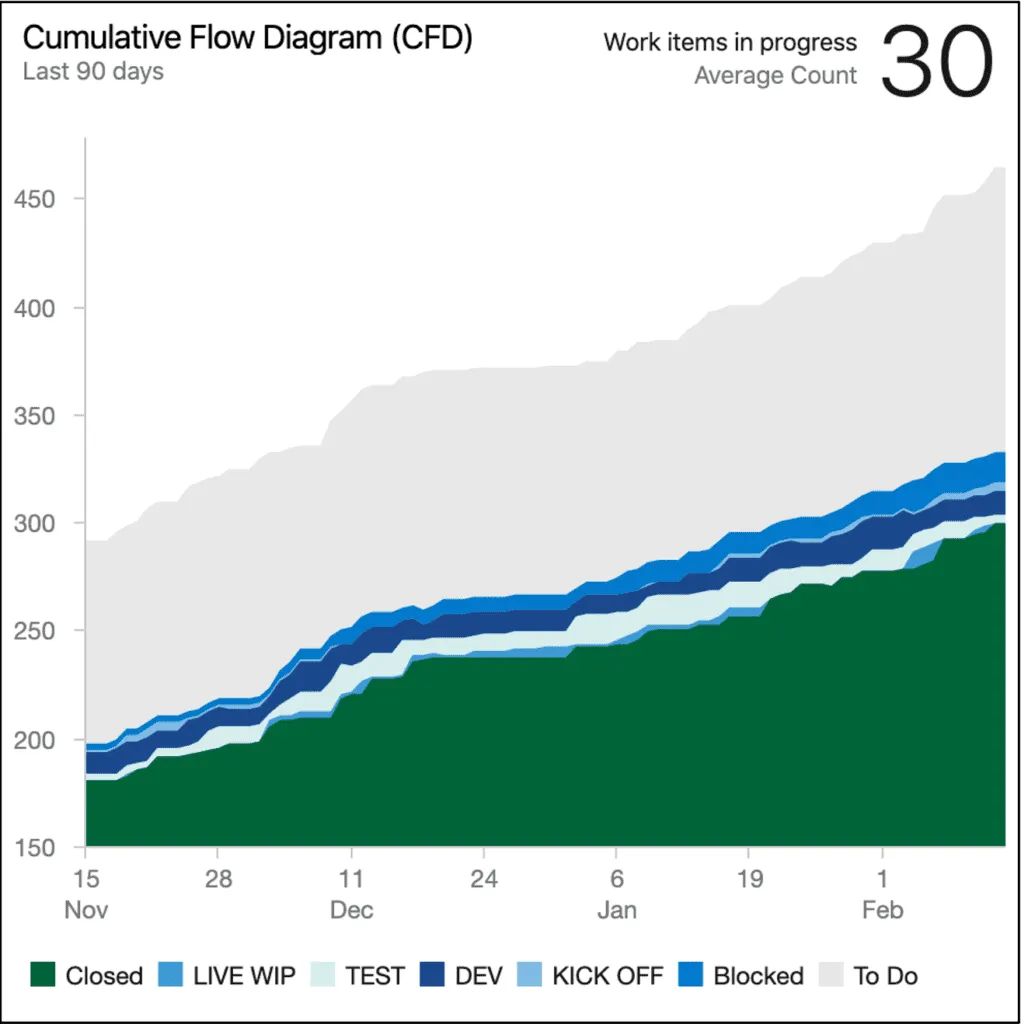
Cumulative Flow Diagram
This isn’t a specific metric but rather a useful visualisation to spot bottlenecks. It depicts the relationship between the 3 key parts of Little’s Law – Work In Progress (WIP), Throughput, and Lead Time.
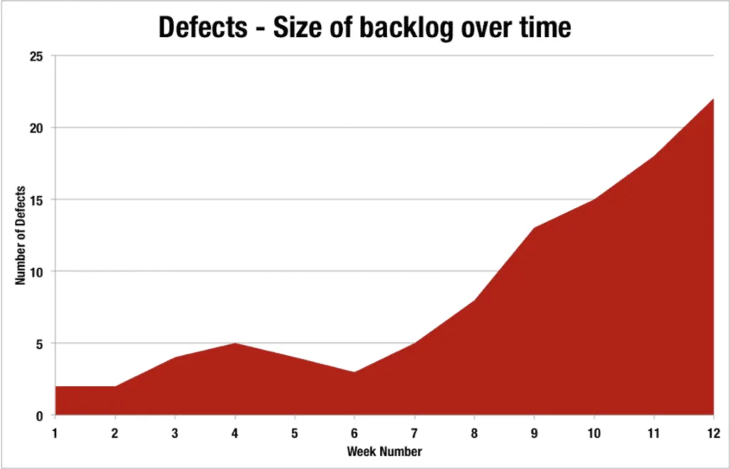
Agile Metrics #4 - Escaped Defects Root Cause Analysis (RCA)
Escaped defects are when defects are found downstream of the team, usually beyond the team boundary. The most obvious type of escaped defects are defects found in the production/live environment. The further downstream a defect is found the most costly it becomes to resolve, therefore it’s critical that we learn from escaped defects.
When a defect is detected downstream from the team it’s critical that root cause analysis is undertaken on every single defect raised. The environment where it was found should be captured along with one of the following categories:
- Code
- Configuration
- Data
- Environment
- Not a bug
- Requirements not met
- Requirements have changed
- Misinterpretation of requirements
- Technical Design problem
- User Interface problem
- 3rd Party
- Integration Problem
- Unable to replicate
- Non-functional requirements
The team should understand the root causes of escaped defects and ensure their development processes adapted to reduce the risk of recurring defects of the same.
Agile Metrics #5 - Quality
Quality is an extremely broad topic when it comes to software development. We won’t attempt to cover the topic exhaustively in this article but rather pull out a few metrics that have proven to be useful for learning about our working practices.
We’ve divided quality into two areas here looking at the internal quality of the software and the external quality.
Internal Quality
- Test Coverage
- Duplication
- Coding Standards
- Cyclomatic Complexity
There are a number of static code analysis tools available on the market enabling you to automate the collection and analysis of internal quality metrics.
External Quality
- Live defects (see escaped defects above)
- Incidents – Mean Time To Recovery MMTR
- Page load times – and other non-functionals
External quality is an inferred measure of user experience and can be measured by a number of different techniques and tools on the market.
Deployment Success Rate
For teams who are early in their adoption of Continuous Delivery and devops it’s important to gain insight into why automated deployments are failing, and more importantly to take action to automate and reduce the number of failed automated deployments. The result of a deployment should be categorised as one of the following:
- Success
- Success – manual intervention
- Failed and rolled back
For failed deployments and deployments requiring manual intervention, a root cause analysis should be undertaken.
The aim here is to understand if our devops strategy is helping us to improve our deployment capability and thus reduce cycle time. Feedback is critical to the team improving.
Technical Debt
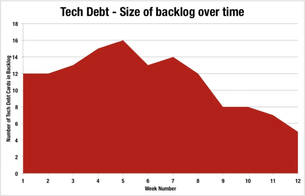
Many teams talk about technical debt but very few of them actually manage technical debt. Teams should capture technical debt as work items in the backlog in the same way that user requirements are often captured as user stories. Making technical debt visible is the first step.
Technical debt is a concept in programming that reflects the extra development work that arises when code that is easy to implement in the short run is used instead of applying the best overall solution.
Technical debt can be compared to monetary debt. If technical debt is not repaid, it can accumulate ‘interest’, making it harder to implement changes later on. Unaddressed technical debt increases software entropy.
Technical debt is not necessarily a bad thing, and sometimes (e.g., as a proof-of-concept) technical debt is required to move projects forward. On the other hand, some experts claim that the “technical debt” metaphor tends to minimize the impact, which results in insufficient prioritization of the necessary work to correct it.
Some people classify technical debt in two ways – intentional and unintentional tech debt.
Intentional technical debt is when a team, in conjunction with the product owner, decide to incur technical debt as a result of a trade-off. A very common cause of this kind of debt is releasing software with known defects. These defects are often low priority defects that are deferred to a later release.
Trade-off decisions come in many forms and for many reasons, but the main point here is to find a way to capture these decisions in a controlled fashion and make them highly visible in the backlog. Combining this with Kanban’s classes of service you can enable a system of balance.
Unintentional technical debt is usually as a result of incompetence or low experienced developers.
It is very common for organisations not to take technical debt seriously. Only when it comes back to haunt them 18 months down the line, and usually at great expense, do they address it. Usually with a large investment to re-platform.
Technical debt should be taken seriously and be serviced as part of the normal course of delivery. Tech debt should be made highly visible and considered an equal work item to other types of demand such as new features.
Development teams need to work harder in order to express the value that each tech debt item would deliver should it be tackled. Just in the same way that other stakeholders have to state the expected value of their demand during prioritisation sessions.
Agile Metrics #6 - Customer Satisfaction (NPS)
Net Promoter Score (NPS) is often used to measure customer satisfaction. There are many resources available online already discussing this metric so we won’t go into this here other than to say, understanding how well your product or service is meeting the needs of your customers has to be the number one focus.
In addition to NPS there are many additional metrics and techniques you can look at to gauge customer satisfaction such as using Web Analytics to infer performance and split testing ideas.
Agile Metrics #7 - Employee Satisfaction
Having a motivated and aligned team is critical to success. Understanding this across your team(s) is tricky to measure – and extremely sensitive in some cases, so tread carefully.
Always check with your HR department or people team first before conducting any kind of data collection. There’s nothing more demotivating for a team than death by survey.
One of the most trustworthy sources of understanding employee satisfaction is to simply talk to your colleagues. This is particularly effective in a safe, high trust environment. In less safe environments you may find these conversations happening after work hours in the pub!
If you are going to run a survey, then I particularly like the colleague version of the NPS which is a single simple question:
How likely are you to recommend working here to a friend or associate?
Add a free text box to the survey to give your staff the opportunity to provide anonymous feedback if they so wish.
Putting learning into action
Feedback loops are critical for learning. You should find opportunities to build feedback loops into your ways of working to accelerate learning. Here are some examples of common feedback loops:
- Daily Stand-ups – why don’t you spend a couple of minutes at the end of each daily stand-up glancing over any key metrics? This assumes you’re publishing metrics next to your Kanban walls frequently.
- Weekly Report – automation of your key metrics should make it easier to publish weekly reports to key stakeholders. Pushing information out is critical to gaining buy-in to your improving ways of working.
- Retrospectives – provide a regular forum in which to analyse your ways of working and adapt accordingly.
- Flow Review – the flow review meeting is a form of retrospective that focuses on cycle time, throughput and WIP metrics. Also known as a Data Driven Retrospective.
- Customer Feedback – find ways to build customer feedback directly into the development team. A few teams we’ve worked with have access to the live feed of comments coming in from customers and pushing this on a large screen in the team workspace.
- Web Analytics & Insight – can provide real-time telemetry into how your software is meeting the needs of customers. The key here is to get this insight as close to the development team as possible.
Questions for Tech Leads
- How do you define tech quality?
- How do you measure tech quality?
- How do you communicate tech quality findings?
- How do you prioritise remedial work?
Questions for Delivery Leads
- How do you define flow efficiency?
- Do your current tools allow you to measure flow efficiency?
- What are your sources of cycle time variation?
- How do you track/measure/manage technical debt?
- How do you ensure a fair balance of tech debt, new features, incidents?
Questions for Business Leads
- How do you know if you’re developing the right thing?
- What commercial metrics are you measured against?
- What feedback loops do you have in place to validate if you’re developing / developed the right thing?
- How quickly can you go from concept to cash?
Summary
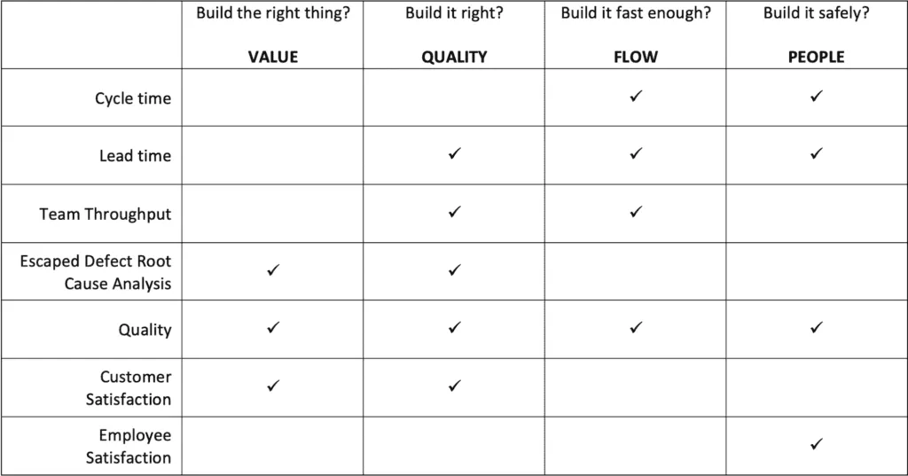
The Solutioneers approach has always been around 4 key delivery principles:
- Build the right thing (value)
- Build it right (quality)
- Build it fast enough (flow)
- Build it safely (people)
By way of summary, It may be useful to show how the 7 key metrics map to the 4 delivery principles.
What are your experiences of Agile Metrics – good and bad? Comment below.
Related articles
Beyond Cycle Time: Introducing Flow Style and Mileage for Agile Teams
Flow Style and Mileage. Understand team dynamics, pinpoint inefficiencies, and elevate your Agile processes for superior performance.
Jira Best Practices for highly productive teams
This is your Jira best practices guide to setting up Jira for highly productive software development teams. Packed full of tricks and tips.
9 tips to improve your Agile daily stand-ups
Nine straightforward tips to make your daily stand-ups shorter, more focused and more useful for the whole team.